the problem:
let’s hear from users.
After asking regular Netflix users about their experience with the app, I found that people were frustrated with the inability to organize, save, and rate their favorite movies as well as view their friends rated and recommended movies. After making a selection on the app, users also wanted to easily transfer to the TV.
scenario:
a user story.
Rivers and Matthew are in the mood for a horror movie, but they can’t decide which one they would like to watch. They always like their friend Adam’s movies, but they can’t remember which ones he’s recommended.
solution:
how I can help.
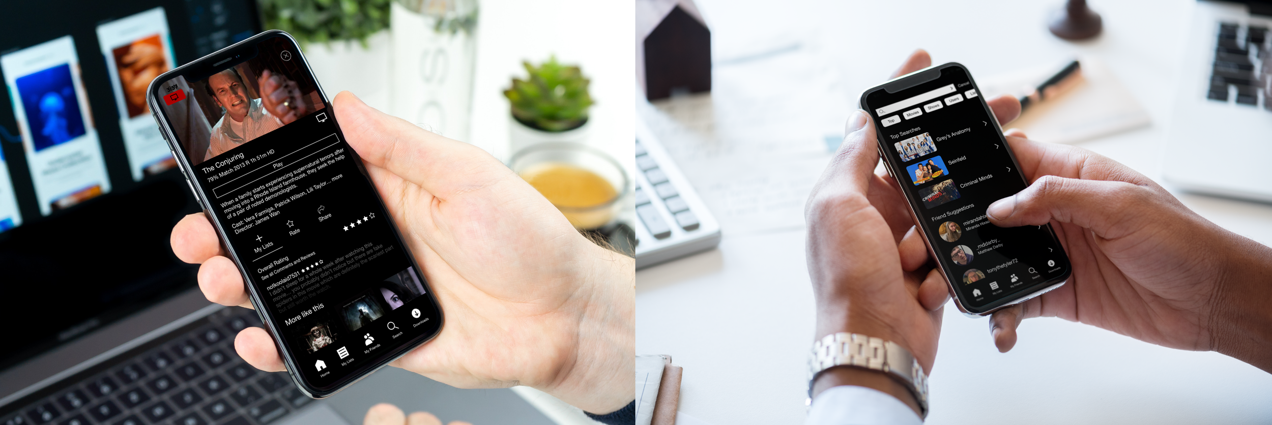
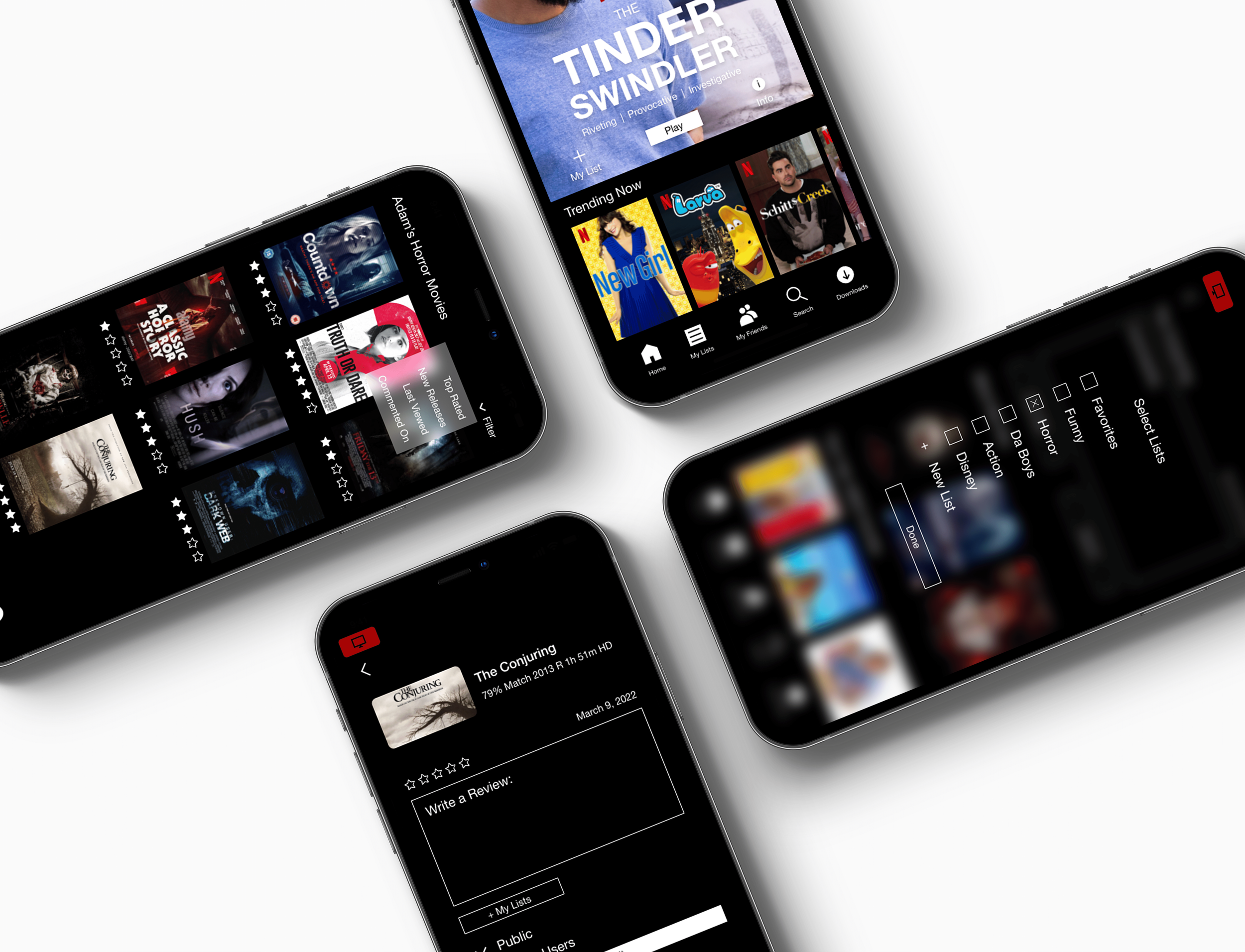
To solve common frustrations, I added four main functions to the app to improve users’ overall Netflix experience.
1. Ability to rate and comment on movies and shows.
2. Ability to search for and add users as your friends.
3. Ability to build, share, and organize personalized lists.
4. Ability to share your selected movie or show with the TV.
user process:
how the story plays out.
On his phone, Rivers searches for Adam, selects his profile, and adds him as a friend. Rivers scrolls through Adam’s lists, selects his horror category, and filters by his top rated movies. They see that he gave The Conjuring five stars, so they click on the movie and share it with the TV. Finally, Rivers rates the Conjuring and adds it to his personal horror list.
now, let’s talk about my process.
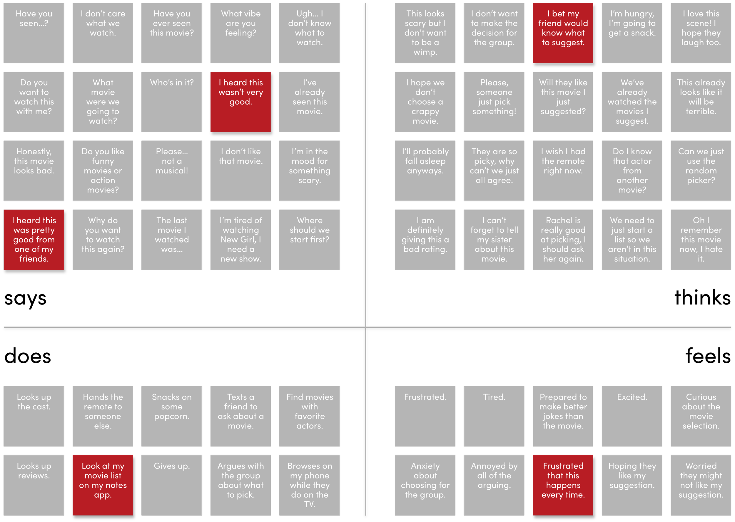
empathy map
Through creating an empathy map, I was able to better understand what experiences users have that I could improve by adding a few helpful functions.
empathy map
1) choosing a movie to watch
2) the role friends play in finding movies
3) finding and playing movies in groups
what I learned
By doing research on what experiences users currently have, I realized that by giving users the ability to upload profile pictures as well as suggesting common friends, users can easily find their friends when searching instead of being overwhelmed by the number of user results.
pain points from journey map
empathy map
By thinking through possible pain points of the process, I was able to think of how I might be able to make a user’s experience easier.
empathy map
1) choosing a movie to watch
2) the role friends play in finding movies
3) finding and playing movies in groups
4) rate the movie
what I learned
I learned that a lot of pain points could be solved with added functions. Although there are many functions that could be added to the app, thinking through the pain points helped me narrow down what the main frustrations are.
accessibility
Through prototype testing, I found that functions that are used in sequence are difficult to get to if they are not located near each other on the screen. Additionally, I had a hard time going back to a previous screen or closing a tab.
interviews
current Netflix experiences
By doing research on what experiences users currently have, I realized that by giving users the ability to upload profile pictures as well as suggesting common friends, users can easily find their friends when searching instead of being overwhelmed by the number of user results.
sketches
exploration
In the initial sketching phase, I began by sketching out current Netflix layouts. I then began to conceptualize what new features might look when added to these current layouts. I sketched at least thirty layouts to explore a variety of ideas and solutions.
problem solving
At this point I had an idea for what functions I would be adding to the app, so I could explore how to solve these problems. What would searching for friends look like? What screen pops up when you finish a movie? How do you rate a show? By working out a lot of these issues on paper, I was able to more easily transition into wireframes.
opportunities
empathy map
By thinking through possible opportunities for how I could make a user’s experience better, I was able to narrow down some thoughts and ideas that would help me come up with how I might design functions.
journey map
1) choosing a movie to watch
2) the role friends play in finding movies
3) finding and playing movies in groups
4) rate the movie
what I learned
Through this exercise, I realized I wanted to give users the ability to select if they wanted their ratings to be public, private, or for friends only. I also wanted users to be able to use their phone while sharing a movie to the TV.
wireframes
After sketching and thinking through possible opportunities, I began to lay out digital wireframes that could be used for user testing.
the process
During this phase, I worked out the basic flow of pages, functionalities, and where content would exist. I then refined it as I received feedback.
prototyping and testing
prototyping
The first prototype laid the outline for how the app would function. By having a clickable wireframe that users could test and provide feedback, I was able to adjust and perfect a lot of functionality before moving into the design phase.
testing
While in the testing phase, I conducted three rounds of user testing, with three users per round. I asked both designers and non-designers to click through my prototype based on instructions and provide feedback.
feedback from testing
frustrations when rating
• When you click the TV, I can’t tell if it’s connected
• I won’t remember when I reviewed this
• I’m confused about what collections means
• What if I don’t want everyone to see this review?
• I want to be able to tell the user I watched the movie
frustrations with user profiles
• I’m confused by what categories means
• I want to be able to see his other followers and friends
• I’m confused by the user names, how do I know which Grace it is?
• I’m having a hard time finding his horror list

final user feedback
post revision survey
After making changes based off of user feedback, I conducted one final survey to make sure that the app functioned smoothly. At this point I received only positive feedback, so I knew I had reached the end of my project for the purposes of this case study.
thank you!
I appreciate the time you took to look through this project, and I hope you enjoyed walking through my process with me!


